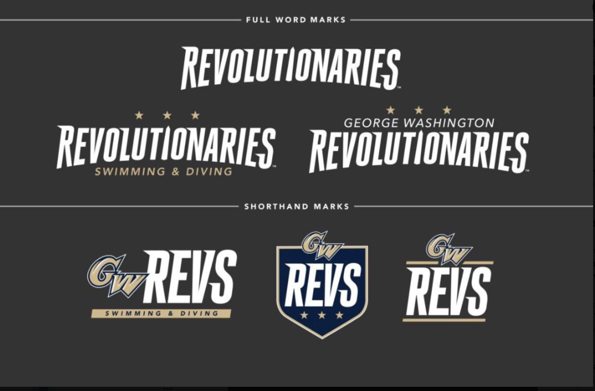
New Rev Logos

Skip to: New Posts  Last Post
Page:  Next »
Posted by Florida Colonial
8/14/2023 3:13 pm
#1

Last edited by Florida Colonial (8/14/2023 3:33 pm)

 
Posted by GW Alum Abroad
8/14/2023 3:49 pm
#2

I will give them kudos for using the Washington Monument for the "i". (Of course, they could have done that for the "i" in "Colonials", too).


Posted by Gwmayhem
8/14/2023 3:53 pm
#3

Really, truly, no kidding....let's do away with Revolutionaries.  It's way too long and has way too many syllables.  Whatever the opposite of "rolls off the tongue" is, that's what Revolutionaries does.  In the context of a school nickname, it is a unique combination of both awkward and ridiculous to say.

Let's get behind Revs.  It has a somewhat cool sound.  It connotes positive energy (like an engine).  If anyone asks what Revs is short for, just tell them you used to know but can't remember.


Posted by GW69
8/14/2023 3:55 pm
#4

Really trying hard to like them.So far I’m failing miserably.Just not a good look - too bad for me.Long form -
too long-short form-“revs”?I suppose that’s all you can do with the short one,but just doesn’t really quite 
work for me.

 
Posted by jf Online!
8/14/2023 4:37 pm
#5

The I with the Washington Monument is very good, as noted above.
But hope this effort wasn't the fruit of a six or seven-figure deal with a marketing company.
  Pretending there a need for this at all, seeing Revolutionaries spelled out just makes a greater case for Revolution. 


Posted by GW18
8/14/2023 5:55 pm
#6

If you need a nickname for the new nickname, then the wrong nickname was picked (still think this was best option of the bad options we were given but still).

 
Posted by Tennessee Colonial
8/14/2023 8:15 pm
#7

ZZZZZZ

 
Posted by BGF
8/14/2023 9:45 pm
#8

Gwmayhem wrote:

Let's get behind Revs.  It has a somewhat cool sound.  It connotes positive energy (like an engine).  If anyone asks what Revs is short for, just tell them you used to know but can't remember.
 

I kind of feel confident that in a year we will all just be saying Revs, like you said.   

Like Terrapins became Terps, Hurricanes became ‘Canes, and Many others in both college and pro ranks. 

Go Revs.

 
Posted by Tennessee Colonial
8/15/2023 10:13 am
#9

Tie it to the Beatles song. There's going to be a revolution. Amazing how destructive people and administrators can be for no good purpose. 

 
Posted by Merrick
8/15/2023 1:03 pm
#10

Air travel = Boredom

GW ranked #1. 

Revolutionaries is now the longest one word college nickname in the country with 15 characters.  There are a handful of other two word monikers that tie or surpass 15, with the Mary Baldwin Fighting Squirrels coming in at 18 if you count the space between the words. If we called the women’s’ teams the Lady Revolutionaries, we’d retake the overall crown.

I was not bored enough to count syllables.

https://en.m.wikipedia.org/wiki/List_of_college_team_nicknames_in_the_United_States

Last edited by Merrick (8/15/2023 1:09 pm)

 
Posted by creeksandzeeks
8/15/2023 2:23 pm
#11

It's... fine... I guess?

 
Posted by Sons of Liberty
8/15/2023 5:32 pm
#12

It's fine. We can make it work.

 
Posted by jersey guy
8/16/2023 11:28 am
#13

I didn't like the name change but here we are.  The logos are not bad. 

 
Posted by GW69
8/16/2023 11:55 am
#14

I think the name and logos are awful.All that matters thank God is how the team plays.In retrospect loving 
Blue Fog.

 
Posted by kdb san diego
8/16/2023 9:24 pm
#15

Dull logos, lifeless and hard to fit on a ball cap.  And the monument should stand out more, larger, different color etc.


Posted by Tennessee Colonial
8/17/2023 12:16 pm
#16

This is the great name change that was forced on us by non-alumni and ignorant people. Basically, this whole useless exercise is to have No moniker. When sanity comes back someday, and we have a fair vote, (meaning only people who should have a voice on this matter, not people who graduated from other schools) we can revisit the issue.  Counter-Revolutionary. 

 
Posted by Buff&BlueBandit
8/24/2023 10:56 pm
#17

So Davidson did a thing...
https://marketing-toolbox.davidson.edu/branding-assets/logos-marks/

Were they feeling so overshadowed by the other North Carolina schools they figured they should compete with the DC market?

Last edited by Buff&BlueBandit (8/24/2023 10:57 pm)

 
Posted by creeksandzeeks
8/25/2023 9:23 am
#18

I'm more convinced each and every day that these "branding agencies" are really just racketeering for something else much more shady, because goodness there wasn't anyone talented working on that Davidson logo.

 
Posted by Gwmayhem
8/25/2023 11:09 am
#19

I know when I think of DC, the first thing I think of is Davidson College.

I guess nobody figured out that there is a school in its own conference located in Washington DC.  Amazing.


Posted by Long Suffering Fan
8/25/2023 1:32 pm
#20

About 50 years ago, during a period of time when I was attending Creigton Law, NBC developed its logo, a multi-colored "N", at a cost of approximately $500,000.00.   They were promptly sued by Nebraska Educational Television for copywrite infringement, as they had developed the identical multi-colored "N" earlier, at a cost of approximately $100.00.


Page:  Next »

 
Main page
Login
Desktop format